You’ve been killing it with your Etsy marketing strategy and getting tons of visitors to your listings each day – you go, girl!
Take a moment to pat yourself on the back, because this is no easy task.
But there’s a problem…your sales are still low.
Why aren’t your visitors turning into your customers?
If this scenario sounds like something you’re going through, you may need to look into optimizing your shop to look & function better.
You need to make sure whatever traffic does come in is completely set up to start spending money rather than hitting the “Back” button in search for something else.
While Etsy may not have a lot of flexibility in creatively changing your Etsy Shop to be customized and unique, there are still so many opportunities to optimize your Etsy shop so Etsy favors you in searches and convert browsers into buyers.
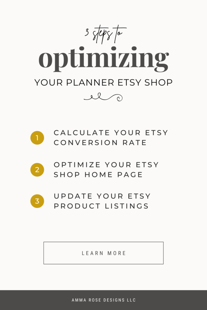
There are a few things you can do to optimize your Etsy shop and make the best of the changes, which include:
- Calculate Your Etsy Conversion Rate
- How to Find Your Etsy Conversion Rate
- Find the Conversion Rate for Each Etsy Listing
- What’s Considered a Good Conversion Rate
- Optimize Your Etsy Shop Home Page
- Rearrange Your Etsy Listings
- Etsy Shop Section Optimization
- Utilize Etsy Featured Items
- Etsy Shop Visual Branding
- Optimize Your Etsy Product Listings
- Optimize Your Etsy Product Photos
- Optimize Your Etsy Product Descriptions
- Review Your Product Pricing
Working on converting your visitors into customers by tweaking a few things is going to help you get so many more sales without even having to increase the traffic to your shop.
Very few Etsy Sellers understand how to optimize their shop, so having an understanding of these principles is going to drastically put your Etsy Shop above your competition.
Step One: Calculate Your Conversion Rate
Your conversion rate is the percentage of visitors who come to your Etsy listings and actually make a purchase. The higher your conversion rate percentage is, the better your shop is doing at turning those browsers into customers.
The awesome part about having a high conversion rate is you can have less traffic but still achieve a high amount of sales!
Obviously, conversion rates are important when it comes to making more sales with less traffic, but they’re also important for keeping track of the adjustments you make to your shop.
By staying on top of your conversion rate, you’ll be able to make better-informed decisions about how you can improve your shop.
If you know your conversion rate, you’ll be able to tell if any changes that you’ve recently made has improved your sales or if they caused a decline.
HOW TO FIND YOUR ETSY SHOP CONVERSION RATE
First, you need to find out how many visitors are coming to your shop.
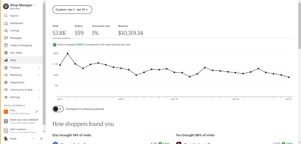
To do this, go to your “Shop Manager” and click on “Stats” on the left-hand side.
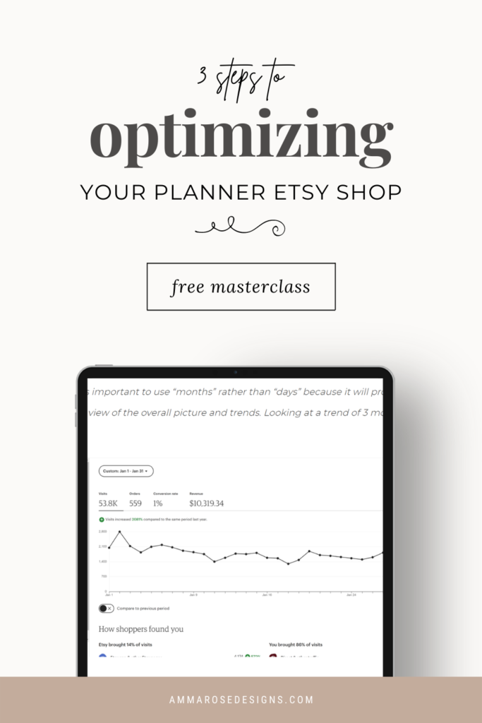
Etsy now calculates your conversion rate for you (super cool!), so you don’t have to worry about any pesky equations. As you can see from my Shop Manager below, my conversion rate for the month of January 2021 was 1%, which tells me I need to go through my shop to see if I have any leaks in my Buyer’s Flow and how exactly I can further optimize my shop!
Side Note: It’s important to use “months” rather than “days” because it will provide you with a better view of the overall picture and trends. Looking at a trend of 3 months is perfect!
FIND THE CONVERSION RATE FOR EACH ETSY LISTING
You can also calculate your conversion rate for each of your individual listings to find the ones that are holding your shop back.
Similar to the following steps to find your shops conversion rate, to do this process for your listings, click on “Shop Manager” and select “Stats” on the left-hand side.
Scroll to the bottom of the page to view your listings stats. You will see your most visited listings near the top and below, your least visited listings.
Go ahead and start with calculating the conversion rate for your top 5 products to figure out which products aren’t converting. Unfortunetly, Etsy doesn’t give you the conversion rate for individual listings, so you’ll have to calculate this by hand
To work out your listing’s overall conversion rate, use the following formula:
Total Number of Orders ÷ Total Number of Visits x 100 = Conversion Rate
So for an example, the math could look like this:
559 (Orders) ÷ 53.8K (Visits) x 100 = 1.03%
This would mean this particular listing has a conversion rate of 1.039033…
Or, if you just round…1%
This gives you a good general idea of how your listing is doing.
If those listings seem to do pretty well converting, you can start moving down the list of your products to find the ones that aren’t converting.
Once you have identified the listings that are lower than the others, review them and figure out why.
WHAT IS A GOOD CONVERSION RATE
On average, the e-commerce industry has an average conversion rate of 2-3%, but it could vary from niche to niche.
As a rule of thumb, you want to stay above a 2% and aim for higher than 5%, however, if you’re working to improve your current conversion rate at all times, then your shop will always be improving (which is what we’re striving for).
It’s not enough to calculate your conversion rate just once. You should be checking every 1-2 months, and you’ll need a way to log your numbers and the changes you’ve made (like changing the photos, updating the SEO, a decrease in price, etc.).
This way, you can see any improvements or declines that your shop is making.
With all of that said and done, increasing your conversion rate is simply a matter of improving your listings and products so your customers feel like without a doubt they should purchase from you rather than your competition.
With a few minor fixes, you can see big results when it comes to getting more sales with the same amount of traffic.
Step Two: Optimize Your Etsy Shop Home Page
Your Shop’s Home Page is a super vital part in your visitors flow through your shop’s sales funnel!
A lot of the phases within your funnel is done right in the central hub of your Shop, so you want to make sure it’s as optimized as possible so your customer flows through all the way until they become your customer.
REARRANGE YOUR ETSY LISTINGS
One of the first steps I tell sellers to make is rearranging your Etsy listings on your Shop’s Home Page.
Etsy gives you the ability to arrange your items based on your best-selling and trending items, which is a great tool to take advantage of to increase your chances of making a sale.
For the best Shop Optimization results, I recommend:
- Organize your listings in a way that inspires customers to hopefully buy more than 1 item at a time. Pair items together that customers have previously purchased together
- Arrange your items by combinations of best sellers & trending items. Make sure to rearrange and update these items every few weeks, depending on your recent sales.
- Continue to refine and improve, possibly once every few weeks
This gives people a chance at finding my best-selling items much quicker and buying them more often.
ETSY SHOP SECTION OPTIMIZATION

Shop Sections are the list of categories on the left-hand side of your Etsy Shop homepage.
These sections are not only important for helping people find what they’re looking for from your Shop Page, but also they help lead customers to find the items they may be interested in while on your individual listing pages.
Obviously, the very first photo they see of your item is crucial to telling the story of your Item. However, often times, a customer is going to quickly see your listing’s first image and then scroll down to understand the item.
If your customer is not interested and they leave your listing, it’s going to be really hard convincing them to come back to your product and purchase.
How we can ensure a greater chance of these potential customers staying in your shop is with the next group of photos on your Etsy listing page – the “More From This Shop” section at the bottom of your Listing Page.
Etsy is going to pull 6 items from your Shop Sections that your main item is also part of to determine which items are going to be shown in this spot.
The reason this little section on the Listing Page is so important is that it is almost like your last chances to impress an Etsy customer with your items.
UTILIZE ETSY FEATURED ITEMS
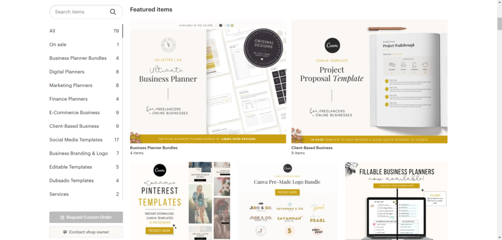
The next way to optimize and improve your Etsy Shop layout is through choosing good Featured Items.
Etsy allows you to showcase 4 or more Featured Items at the top of your shop and choosing the right items in this section is very important for your shop’s growth.
The items you display here are the items that you want to spotlight and encourage your visitors to visit. This may be your best-selling item, a seasonal item, or items that are on sale.
You should revisit the Featured Items section frequently and change it up as you see fit.
ETSY SHOP VISUAL BRANDING
Brand Design is what you may typically think of when you think of branding.
These are things such as your shop icon, cover photo, packaging, and product photography.
You’ll want to make sure that each of these component are cohesive, appealing, and makes a unique statement about what your business is all about.
Think about how you want your customers to feel when they land on your shop. Additionally, always consider if your brand is cohesive across all of your design elements.
YOUR SHOP BANNER
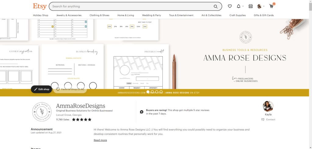
Having a shop cover page is a great way to display your brand and inspire your customers with your call-to-action.
It’s not there just to look pretty!
This is a good way to display certain information or get your visitors to do certain things you want them to do.
Here are some ways you can use your cover image:
- Use the cover image to tell customers more about your shop with some text and photos
- Offer a coupon code to give people an incentive to buy from you soon
- Advertise when there is a sale going on
- Direct them to your website or social media links
- Display any accomplishments or acknowledgements you’ve received to increase your authority (ex: Perfect 5-star reviews since 2012)
Etsy allows you to choose between a banner and a cover photo, which are two different sizes.
A banner, which is smaller, does not show up on mobile devices, while the larger cover photo does.
I personally prefer Cover Photos, but you can choose whichever you prefer.
You can use either PicMonkey, Canva, or a phone app to create your own design.
Your cover photo or banner, at the bare minimum, should include:
- Your Shop Name
- Your Logo
- A Call-to-Action
If you’re not design-savvy or would rather have something pre-made, there are plenty of customizable Etsy banners! Take a look at our pre-made Etsy Branding Bundle for Planner Shops so you can create your shop branding in half the time, while also putting your own personal touch to it so your audience values it even more!
Related Post: My Top Favorite Etsy Branding Kits for Printable Shops (coming soon!)
Shop Profile Picture

Your Shop Profile Picture should be a good-quality business logo.
Make sure whichever logo you choose or create that it’s cohesive with the overall feel of your Etsy shop.
With our shop being modern & simple, we opted for a straightforward, white & black logo, as you can see above. This logo compliments our brand so well and we’ve used it for years now!
Shop Owner Picture
Your Shop Owner Picture should be a good-quality headshot of you and your smiling face!
Let your customers feel more connected to you and put a face to your shop.
Don’t feel like you need to spend money to get professional photos done. My headshot was snapped by my husband on a random afternoon!
About Section
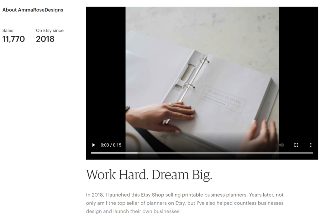
Scroll down and begin to input information all about your work process, your workspace, or anything else that gives your buyers an inside look into your business and behind-the-scenes.
You can add videos and photos, and share your story!
I have a series of stock photos, as well as an amazing product video showcasing my best seller – the Ultimate Business Planner.
Step Three: Optimize Your Etsy Product Listings
The very first page a customer usually sees is through your individual items, typically through a keyword search. Almost always, they do not see your Shop’s Home Page first.
As an Etsy shop owner, you need to think like an Etsy customer and experience how the customers uses your shop, instead of experiencing the shop as an Owner.
With that being said, let’s take a look into how we can optimize our Product Listings to keep your potential customer engaged.
OPTIMIZE YOUR ETSY PRODUCT PHOTOS
Arguably, product photography is one of the biggest downfalls of many Etsy sellers.
In my experience, in excitement to launch your Etsy shop, many people quickly design a photo of their product in a few different angles and throw it up on their listing – having full intentions to update the photos soon…but usually never do.
As the average consumer, we remember more of what we see compared to what we have read. If something is visually appealing and stands out, it’s hard to get it out of your mind, even if you’re looking at a competitor’s product.
This means that you’ll have to provide extremely descriptive and high-quality photos to give them that “feel” of knowing exactly what they’re going to get when they receive it in their inbox.
The first step you’ll want to make is improving your featured photo (the very first photo your audience will see in their Etsy search).
Improving this featured photo is going to increase the chances of someone clicking on your listing.
But it doesn’t stop there!
You’ve gotten them into your door, now you have to keep them there – and that’s where the 9 additional photos come in.
Take advantage of these 9 additional opportunities to capture your potential customer and provide as many details as possible, answer questions you think they’ll have, and prove that you’re a trustworthy seller.
Getting your photos right is key because of the amount of power they hold!
Here are some things to keep in mind when you’re taking photos of your products:
- How is it special?
- Size (try using a sizing chart)
- Show scale (like holding it in your hands, item being modeled, next to similar sized common items, or the item in its natural surroundings)
- Quantity
- Variations (or options) available
- Color Chart
- Show item in-use
- Show the details
- Social Proof – testimonials or customer photos
- An image that asks them to sign up for your newsletter or follow you on social media
- If you offer custom or commissioned work, let them know it!
By answering all of your potential customer’s question plus more, you’ll have them adding your items to their carts instantly!
Resource: Planner Bundle Listing Photo Templates
OPTIMIZE YOUR ETSY PRODUCT DESCRIPTIONS
Your Etsy product descriptions, next to your product photos, are one of the most important features inside of your listing. This is where you can break down your product to the finest detail, what’s included, and why your potential customer needs to have it.
I’ve seen some descriptions that provide too little information, which cause your potential customers to have questions. Most people won’t take the time to reach out to your via Messages to clarify, meaning you’ve just lost out on a sale!
Use the tips below to draft an informative, easy-to-read product description for any of your planners, workbooks, checklists, guides, ebooks, etc. that you sell!
SEO IN YOUR ETSY PRODUCT DESCRIPTION
Along with your title and tags, you’ll want to use the same keywords and keyword phrases in your description to optimize your listing to get found in an Etsy search.
Place both the broad keyword and the longer, more detailed keyword phrases near the top of the description in a natural sounding way.
As you fill in the remainder of your description, continue to add in your keywords where you see fit.
You don’t have to overdo it and stuff your paragraphs with all of your keywords. In fact, that may do you more harm than good.
Focus on writing a natural sounding paragraph and try to use each keyword at least once, mainly focusing them near the top.
UNCOVER THE STORY OF YOUR ITEM
Put your customers in your head when you were deciding to create your product.
In order to have them relate, you’ll want to highlight a pain point or a problem that your targeted audience normally experiences.
Go on to explain how you relate to this problem and how it inspired you to create your product. Then, explain how your product will solve this problem or help eliminate it for the shopper if they buy it.
Complete this step briefly. Don’t write more than 1-2 paragraphs.
DESCRIBE YOUR ITEM
Think about questions your buyers are likely to have about your product. Then, answer those questions in your Etsy product description. Luckily, you may have answered most of the questions when you were coming up with your keyword phrases. Consider the following points that you may want to include:
- What is your product?
- What does your product do? Does it have a specific function?
- Who is your product for? Additionally, who is your product not for?
- How does your product work?
- What color is your product?
- How big is your product?
- What materials did you use?
- What techniques did you use to construct your product?
Fill in the remainder of your Etsy product description with any other details about your item, such as shipping information, policies, and any other information your customer may need to know.
The more your potential buyer can learn from your description, the better chance you have of making a sale.
Overall, you’ll want to keep your description short with few and brief paragraphs and bullet points.
REVIEW YOUR PRODUCT PRICING
As an Etsy seller & business owner, you want to make sure you review your prices frequently to assure that they reflect the dynamics of cost, market demand, response to competition, and profit margins.
It’s super nerve-wracking to price your items, because if you do it wrong, you’ll notice it affecting your sales.
If your prices are too low…
You won’t make enough money to stay in business and your product will be perceived as poor quality or cheap.
If your pricing is in the middle…
You’ll only be making just enough to cover costs but you won’t ever grow as a business or create more products
If your pricing is too high…
You risk your customers going with your cheaper and just as valuable competitors.
If you want to build a sustainable business, you’ll have to calculate your pricing just right to cover costs, attract your customers, and make a profit!
Thankfully, it’s as easier than you probably think, especially as a seller who only offers digital downloads!
CUSTOMERS WANT A GOOD DEAL
Point. Blank. Period.
If they feel like they’re going to get more value for the same price or cheaper from another shop, then they’re going to most likely take them over you.
Of course, you don’t want to lower your prices so much to where you’re not making any profits, so you should focus on adding value to your customer.
Price your items within your market’s average and stack on the additional value that your customer won’t find anywhere else.
This could look like:
- Share your creditials (if you’ve worked with a bigger brand, tell any and everyone! This sets you miles ahead of your competitors and seasons you as a seller)
- Share (good) social proof
- Tell your customer why your product is better quality
- Add valuable freebies
- Shout out about being a small business
You don’t always have to price around your competitors or cheaper.
If you feel like your product is worth more, raise your prices and explain to your customers why it’s worth more money over your competition.
CONSIDER YOUR HOURLY WAGE
Simply having a profit isn’t enough.
Some of that profit money is going to go right back into your business to help it grow. But, you also need to pay yourself as you would an employer.
What would your hourly rate be? How much is the time it takes to create each item worth to you?
Think about how much you would need for living expenses and to pay your bills. Of course, don’t get outrageous with this rate. Your pricing needs to make sense.
BE AWARE OF YOUR MATERIAL COSTS
What is the cost for all of the materials used to create one product? Consider how you’re going to break down the costs of the software that you use to design your digital product.
TAKE NOTE OF YOUR COMPETITORS
You should definitely be paying attention to how your competitors price their items as your business continues to grow.
Your competitors can be your reference for your own pricing:
- Price lower than them to take their business
- Price the same to compete
- Price above them to create the perception of a more valuable product
While you want to calculate your pricing to ensure your labor and materials costs are covered, always reference your competitors to make sure you’re either taking their business, directly competing with them, or being perceived as having the most valuable product.

Optimizing Your Etsy Shop
Phew!
It may seem like a lot to take on at once, but implementing these tips here and there over time will lead you to a higher chance of converting those browsers into buyers.
Take a moment to let me know your thoughts in the comments below!
- Have you fully optimized your Etsy shop yet?
- What are some things you’d like to implement into your strategy from this list for the upcoming month?
- How often do you go through your Etsy shop and make sure everything is as it should be?

