How to Design a Planner
So you want to design a planner. But, when you sit down in front of InDesign or even Canva, you’re lost on what exactly makes a good planner design. How should you structure each page? What makes good design? What goes into not only making a planner look pretty but also functional?
Each of these questions and more lead to you closing out your browser and putting off your dreams of designing for another time.
Well, let’s talk about it now.
Incorporate White Space Into Your Design
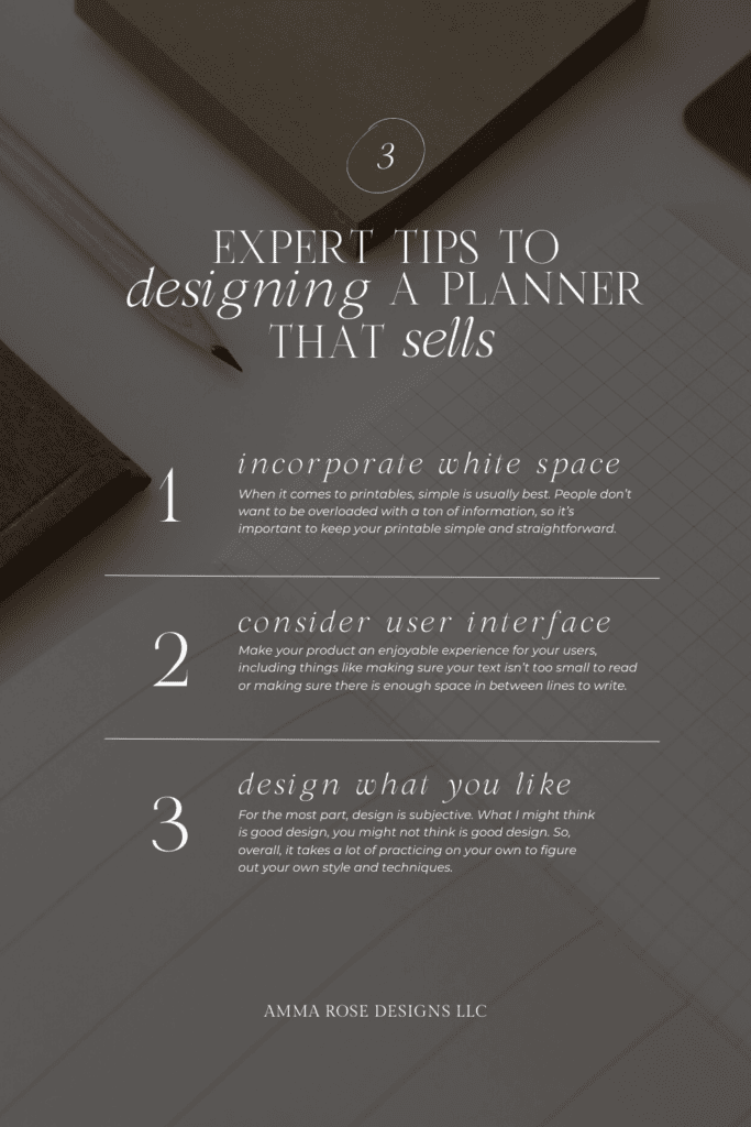
The first tip to designing a planner is White Space. One of the first signs of a bad design is if you take one look at it and your first instinct is that it’s too cluttered. Or if it just feels like you don’t know what to focus on first.
Don’t feel the need to take up every square inch of space on your page. You want to leave white space around the elements on your page to prevent an overwhelming experience for your users.
When it comes to printables, simple is usually best. People don’t want to be overloaded with a ton of information, so it’s important to keep your printable simple and straightforward. A good rule of thumb is to:
- Include only the essential information in your printable
- Always try to avoid cluttered and visually chaotic designs
- Use clean lines
- Stick to 2-3 different colors or less
- Use 1-2 different complimenting font pairings
- Try to limit non-essential design elements like abstract art or graphics in the corner of your page, unless it’s fitting for your brand
Following these simple tips, you’ll be able to create a product that is both user-friendly and stylish.
Be Conscious of the User Interface
Next, you want to be extremely conscious of the user interface of your page. What I mean by this is you want to make your product an enjoyable experience for your users, including things like making sure your text isn’t too small to read, ensuring your prompts are easy to follow, or making sure there is enough space in between lines so that people can easily write or enter information.
My style of design is incredibly user-centric, so I’m always keeping in mind how the user will feel or what they’ll think when they’re interacting with the design, and trust me, customers will notice this. It’s always refreshing to have a product that just works, and doesn’t leave you frustrated or annoyed.
To accomplish this, ask yourself how people will be using your planner. Will they be printing it out and using it as a physical product, or will they be accessing it digitally? If people will be printing it out, will they need to print it on standard printer paper or will they need to use a special size? Would your audience rather have multiple prompts to guide them through their product, or something that’s more straightforward?
This is why studying and researching your target market beforehand is so important to the success of your business. You are, at the end of the day, designing a product that is meant to be useful for them, so you’ll have to be thinking about their needs, wants, and desires as you’re going through the creation phase.
Design What You Like
And lastly, design what you like. For the most part, design is subjective. What I might think is good design, you might not think is good design. So, overall, it takes a lot of practicing on your own to figure out your own style and techniques.
I originally was going to do a complete overview of the 7 design principles and how you can implement these “rules” into your design. But, if I did that, I wouldn’t be doing you justice. The truth is, when I sat down and tried to think about my mindset as I’m creating a project, I realized that I don’t actually think about any of the design principles as I’m designing.
I don’t say, “Oh, I need some contrast here, or some movement there”. I simply just design what I think looks good. A lot of times, this means designing something, not liking it, and then designing it again until I do like it.
So, design what you think looks good, and if you don’t know what looks good, make it a habit to browse through the planner section in Target, or search through Pinterest for planners and take note of the style you like. Do you gravitate towards flowy script fonts, simple black and white pages, or bold colorful designs?
Whatever you like looking, take those concepts and transfer it over to your own style as you’re designing.
Top Planner Design Tips
Alright you guys, those are my quick design tips on creating a planner that sells. A quick recap is:
- Typically simple is best
- Keep your user in mind as you’re formatting your planner layouts
- Design what you like
If you keep those things in mind, you’re well on your way to be a top designer!
And also, if you’d like to learn more about how to actually sell your planners online, feel free to check out our free ebook – How to Successfully Sell Digital Products Online – where we’ll go over how to take the planners you’ve designed and turn them into passive income.
As always, thanks so much for stopping by. Until next time!